(I originally published this to the wrong blog!)
A quick and fun project. After the mess I made of the previous two assignments, I need all the points I can get
Saturday, June 26, 2010
Deepwater Horizon Animation
Deepwater Horizon Oil Spill


 (I originally published this to the wrong blog)
I had only a few problems with this project. The points I imported from Exel were a little off, so I adjusted them with the edit shape function. Drawing the polygons were not a problem until I got to the tracing. I strugled with that for about an hour, then just edited the polygon to the Fed/State line. The area and comparison were straightforward, and I did the chart in Excel.
Sunday, June 13, 2010
GIS and Disaster Planning
In the immediate aftermath of any disaster, there are always questions. The most urgent are: who needs help, where, what resources are available, and how will we get those resources to the people who need them. A great many decisions must be made in a short period of time. Any information that can support those decisions will be welcome. GIS has grown in the last decade into one of the most powerful decision-assistance tools.
The questions of who, where, what and how can all be stored, and when properly maintained and updated, can provide critical information to first-responders, volunteers, and those involved with long-term recovery. Relationships between locations and events can be analyzed and proper remediation can be planned. Areas that have been cleared will not be allocated precious manpower in pointless efforts.
At my workplace, South Florida Water Management District, the first week of June is 'Hurricane Freddy' (Freddy is our cartoon alligator mascot). This annual exercise is a dress rehearsal for the hurricane season, and includes testing the alert roster, assembling the EOC staff, and updating the GIS databases. All conceivable aspects of a potentially devastating storm are considered.
The Deepwater Horizon oil spill event is an excellent example of using GIS to assist the response to a catastrophe. It has the potential to affect millions of people and thousands of acres of sea and land, disrupting the economic and environmental balance of the whole Gulf of Mexico and beyond.
The most obvious use of GIS is to predict the movement of the oil with the known currents of the Gulf, and attempt to provide protection to the most sensitive areas of the coast. Records of what has been done and where will prevent duplication of effort and wasted money and resources. The hazard to health and safety can be tracked, and the specific members of the local population warned of impending danger.
Module 5 - Urban Planning


This assignment went pretty smoothly. I didn't have any of the usual problems. The ESRI VC assignments are informative and well laid out. I think I even undestood the consepts, even though I've never done this type of work before.
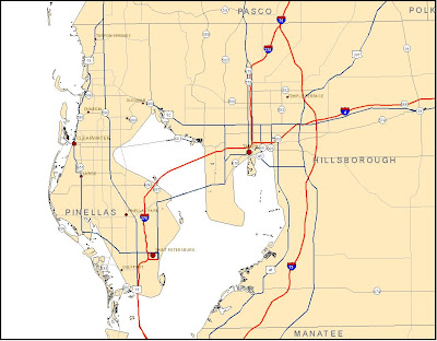
Module 4 Deepwater Horizon Oil Spill


I didn't have too many problems with this assignment, but it seemed to take a long time to accomplish. I did't have any projection problems because I did a lot of prep work before I opened ArcMap. I collected all the data files, checked the projections, then chose UTM 16N for the working projection. I projected each file and saved them in a folder called "Projections", then made a sub folder called "clipped" and clipped all the files to the Quad I was working in. I finished at 5:05 PM EDT and then uploaded the wrong file format to the dropbox.
Saturday, June 12, 2010
Module 3 - Hurricanes

I'm really pretty embarrased by this product. I never did get past the elevation conversion. I fudged a flooding map by manually classifying the elevation in meters to display only the areas that would have been subject to the storm surge (2.4 meters). I could not do any of the analysis since that was all dependant on the conversion.
I was also dissatisfied with the resolution of the raster files when working at this large a scale. If I have any spare time (ha,ha) I' like to re-do the exercise with an elevation raster I stumbled on form work. It's a 10-foot DEM (as opposed to 30 meter) and it shows so much detail, looks almost like an aerial photo. I think I can get a High-resolution landcover file as well. I just need time to look.
Wednesday, April 28, 2010
Saturday, April 10, 2010
Module 11 : Labels and Spatial Analyst
Item 1: Cities and Roads from 'Mamage your Labels with Class'
 This exercise was a good supplement to the Cartography class's section on labels and annotation. I'm surprised that it did not cover the 'Change labels to annotation' function.
Item 2: Recreation from 'Add Custom Text to your Maps'
The model graphic seems to be a basic flow chart, providing a visual representation of the process.
Item 4: Reclassed vegetation map from 'Reclassify your Data to Common Scale'
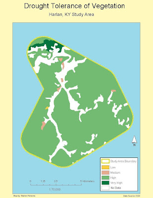 After I completed the reclassification, I changed the colors to accentuate the diffeent areas of tolerance and changed the legend labels to meaningful words as opposed to numbers.
 This exercise was a good supplement to the Cartography class's section on labels and annotation. I'm surprised that it did not cover the 'Change labels to annotation' function.
Item 2: Recreation from 'Add Custom Text to your Maps'
 The ability to use the spline labels and call-outs will be very handy in future assignments.
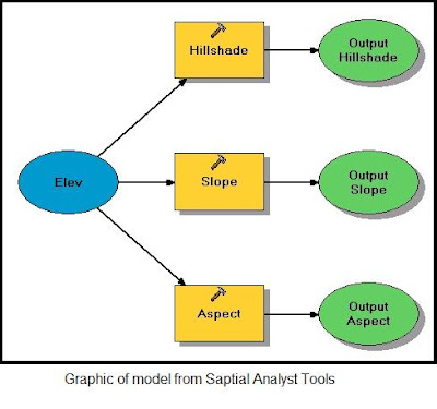
Item 3: Screen snapshot of model graphic from 'Working with Spatial analyst Tools'

The model graphic seems to be a basic flow chart, providing a visual representation of the process.
Item 4: Reclassed vegetation map from 'Reclassify your Data to Common Scale'
 After I completed the reclassification, I changed the colors to accentuate the diffeent areas of tolerance and changed the legend labels to meaningful words as opposed to numbers.
Friday, April 9, 2010
Module 9: Raw Data and Tables

I accidently deleted this post while reviewing the blog in preparation for the week 11 work. Fortunately I had an extra saved copy of the map.
I had a difficult time finding the right file to download on the DOR website. There were several tables and only one included the combination of Parcel ID and Owner's name. From there, doing the Smmary and selecting the four largest landowners was fairly easy. I created a new layer and defined the four different colors to the property owners.
Tuesday, March 23, 2010

Q1: I used the Intersect Tool on the second trial of the exercise. I had the results of both methods on the map, and compared them by turning one or the other off and on several times. I could not find any differences. The Intersect Tool was what I had expected to use as I worked the problem the first time. Using the Union Tool was a good demostration of the princilple that there are always several ways to reach the same result.
Q2: I used the Erase Tool to eliminate the parts of the selected areas that overlaped the conservation areas. That seemed to be the most efficient way to remove sections that needed to be excluded in the final analysis.
Q3: There were 72 features in the final layer. The largest has an area of 7,765,034 square meters, and the smallest is 748 square meters.
Monday, March 8, 2010
Flashback to Data Search

My primary problem with this section of the lab assignment was re-projecting one DOQQ. All four came from the same source, and I thought were in the same projection. But there is apparently a critical difference between GCS_North_American_1983 and GCS_North_American_1983_CSRS. I didn’t notice the minor difference at first, until the latter could not be re-projected. ArcCatalog closed abruptly each time I tried to perform the operation. I eventually downloaded other DOQQ files and had no problem.
I added the USGS Quad background, which I clipped to the county boundary. I did not have to clip my other layers (I was able to download already clipped layers for my county), and wanted to practice that part of the lab.
I was eventually able to research CSRS, and discovered it is the Canadian Spatial Reference System, which is a 3-dimentional system. It includes data not only on height (elevation?) but gravity and earth rotation. It’s no wonder ArcCatalog choked on it.
I don’t know why one of a set of four DOQQ files was in that format, unless LABINS is in the process of converting to that format.
Wednesday, March 3, 2010
Module 7: Data Editing
 Projection: Florida State Plane North
I have actually done this type of editing before. I used to create a lot of vector maps my office needed from georeferenced aerial photos. I did learn a few new methods and updates to the software. My biggest problem is being too perfectionist in following the roads and building outlines. I tend to use many more vertices than are needed at the scale the map will be used.
Saturday, February 27, 2010

Compared to the previous lab, this one was fun! I have always been intersted in georeferencing aerial photos, but never had the access to a version of ArcGIS that included that capabiity. I did have to delete several control points and restart when I connected the points backward or not accurately enough.
Wednesday, February 24, 2010
Data Scavenger Hunt
 I actually got rather carried away looking at all the possible data sets. Fortunately, almost all that I ended up using were in the Albers Equal Area projection, and I had to do very little re-projecting. I selected out the major roads fron a file that seemed to have every dirt trail in the marshes, cattle ranches and citrus groves. I removed 'swamps/marshes' fronm the hydrology layers leaving only streams, rivers, ponds and lakes - most of this county seems to be wetlands.
  I wanted to use the Invasive Plants data with the Strategic Habitat Conservation Areas, but there was only one point in Okeechobee County in a state -wide data set. I think the conservation and wetlands combination makes a logical pair.
Friday, February 12, 2010
The Earthquake in Haiti
 This layer package was on the ESRI web site for resources on the Haiti earthquake. The base layer is an aerial photo, and the overlay is from the USGS sensors that measured the strength of the tremors at several distances from the epicenter. This will provide an excellent indication of how much damage to expect in different areas, and what locations may be sfe to relocate the population.
A Tale of Three Projections

The task this week was to take one shapefile and re-project it from the original to two other systems, then calculate the area of four counties.
It was emphasized in the reading assignment that there are errors associated with all projections, due to the difficulty of transforming an 'oblate elipsoid' onto a flat surface. It was not surprising that the calculated ares of the four counties varied. Each projection has a different base reference point, and the farther from that point, the greater the distortion.
Wednesday, February 3, 2010
Week 3
AN ARMCHAIR VISIT TO MEXICO

The exercise was acctually pretty straightforward, and included a number of tasks I was already familiar with, but I kept finding new, small improvements I wanted to make, like making the scale bar an even number and resetting the overall scale to a round number that was the right size for the layout. I meant to go back and add background color to make the map more readable, but ran out of ArcMap access and time.
-------------------------------------------------------------------------------------------------
 This map is still way too crowded. I had a hard time making the urban areas visible, since I wanted the roads to be on top of the cities in case the user wanted to zoom in to see detail. I think it would be better to focus on displaying fewer features (roads or rivers) and at a larger scale. Again, I ha a few inprovements planned, but Arc Map syopped responding at the last minute. I would have especially liked to add background color to make it easier on the eye.
------------------------------------------------------------------------------------------------

I really liked this color ramp for the raster elevation layer - the white looks like snow on the mountain tops, and brown and green for the middle levels. I think a map user would find the colors pretty intuitive. I would have liked to change the lowest color to more green than blue, but when I added the blue background the rest really stood out.
Sunday, January 24, 2010

Monday, January 18, 2010


Subscribe to:
Comments (Atom)